2016/09/20
HKI Announces a New Logo
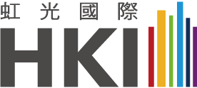
Taipei / September 20, 2016 – HKI Corporation is introducing a new corporate trademark as it enters its sixth year. The new design uses a slightly modified font, and the rainbow pattern has been fine-tuned to depict a colorful, vibrant group of buildings.

The “HKI” graphics exude strength and solidity, symbolizing a business that is “steady as a rock” in the tradition of the “Kahatex Spirit” and “Kahatex Textile’s” emphasis on stability.
The colorful, vibrant pattern of buildings symbolizes HKI’s unwavering pursuit of excellence and dedication to flawlessly interpreting “comfort.” It is emblematic of the full expression HKI has given to a diverse range of spaces, such as homes, offices, restaurants, and hotel and shopping areas, and also evokes the company’s steady steps in cultivating deep roots in Taiwan and growing together with society.